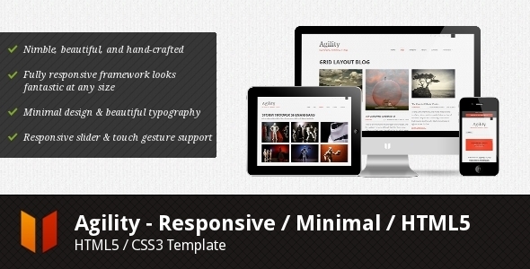
Agility is a fully responsive HTML5 / CSS3 template, ready to look stunning on any device – from a widescreen monitor to a mobile phone.
How does a responsive template work? You create one site, and Agility’s responsive framework does the rest. As the user’s viewport size shifts, Agility responds dynamically to optimize viewing for that screen size. That makes experiencing your site on a mobile phone much more enjoyable (no more pinching and zooming just to read a paragraph), without sacrificing complex grid layouts at the full-screen level.
So what does that mean? Agility is built on a 960gs-based responsive grid system called . Using the magic of media queries, as the viewport size changes, the grid adapts to fit the viewport optimally.
What’s in the box?
- – Home pages, Portfolio, Blog, Page, Post, Contact, and more
Demo URL:
Did you enjoy this article ?
We are nothing without our users ! You can help us offer even more high quality content. Please share our page !
 MAFIASHARE
Sharing is caring
MAFIASHARE
Sharing is caring