Search for H8.mobile Template »
If you have this item please contact us if you want to share it !
Update v.1.1
Twitter integrated. Now all you need is just specify the user name and a number of twits to display.
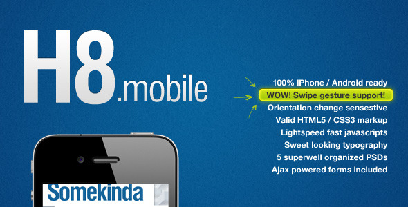
H8.mobile Mobile is a HTML5 /CSS3 template tuned to look perfect in mobile browsers. The markup is device orientation (landscape/portrait) sensitive, so when you change device orientation by rotating it 90 degrees CW or CCW this template will look nice. Also it supports the swipe gesture you can test it on a image slider located at the
I’ve used HTML5 and CSS3 to create this template. This foremost marking languages allows me to create the fastest and the most advanced templates like this one. That gives us the lightspeed fast page load that is crucial to the modern mobile surfing.
Due to the state-of-the-art HTML5 language I was able to code this device independent template. No device detection scripts and other weightfull and resource slaying javascript libraries just pure HTML screen resolution detection.
The simpliest ever script allows detection of device orientation changing. Which improves the readability and overall user expirience. To check how it works just turn your device 90 degrees CW or CCW and see the magic. This little tweek is very useful and incredibly fun!
I strongly advise you to use iOS & Android devices for preview.
This template will fit perfect for a mobile blog or magazine, maybe even for mobile portfolio.
For now, all support questions can be directed to the comments, or, please feel free to email me using the contact form on my profile page.
We are nothing without our users ! You can help us offer even more high quality content. Please share our page !
 MAFIASHARE
Sharing is caring
MAFIASHARE
Sharing is caring