Search for My Mobile Page V2 »
If you have this item please contact us if you want to share it !
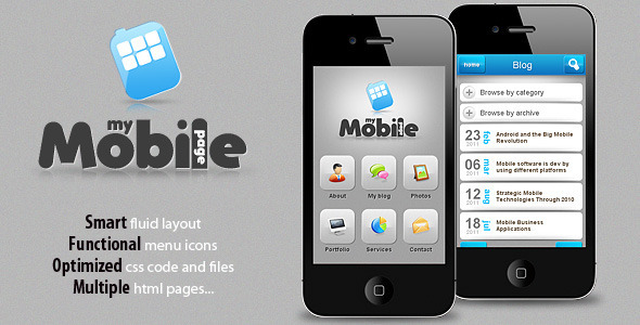
My Mobile Page V2 is the second version of “My mobile page” template. We have decide to create an improved version of this template with a fluid layout that will automatically adjust to the screen size. The new fluid layout is built using CSS3 amazing features and some nice jQuery effects.
Open you “desktop theme” main file (this must be a php file, if not you must create it .php) and right at the top include this code:
include("Mobile_Detect.php"); $detect = new Mobile_Detect(); if ($detect->isMobile()) { header('Location: http://yourmobilewebsiteurl.com'); }
?>
**Make sure you write your mobile website url corectly here: “http://yourmobilewebsiteurl.com” **
Just open the php file, and right at the top code lines you will see email located. Just replace that email with yours. Now just make sure to link your contact icon from home menu to contact.php instead of contact.html file. Also to remember that we have included a javascript file to help validate the inputs. The file is located in “js” folder.
We are nothing without our users ! You can help us offer even more high quality content. Please share our page !
 MAFIASHARE
Sharing is caring
MAFIASHARE
Sharing is caring